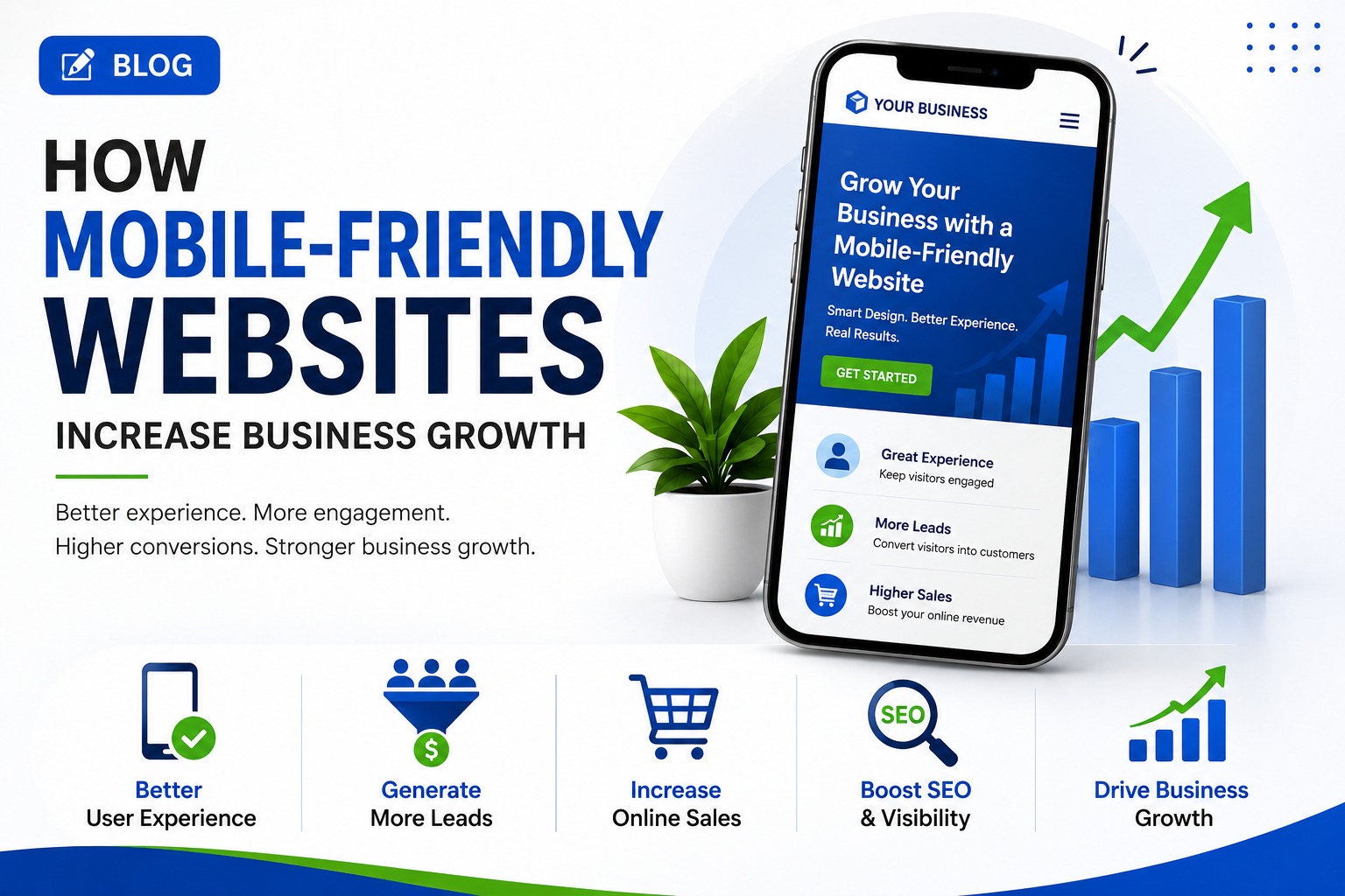
In today’s digital world, your website is often the first interaction a potential customer has with your business. Since a large portion of internet users browse through smartphones, having a mobile-friendly website is no longer optional—it is essential for business growth.
A website that works smoothly on mobile devices can improve user experience, increase engagement, generate more leads, and ultimately help businesses increase sales.
What Is a Mobile-Friendly Website?
A mobile-friendly website is designed to provide a smooth and consistent experience across smartphones, tablets, laptops, and desktops.
It automatically adapts its layout, text, images, buttons, and navigation according to the visitor’s screen size. Users should be able to read content, browse pages, fill out forms, and make purchases without constantly zooming or scrolling horizontally.
1. Improves User Experience
First impressions matter. If visitors open your website on their smartphone and find tiny text, difficult navigation, slow-loading pages, or poorly positioned buttons, they may leave immediately.
A mobile-friendly website makes it easier for visitors to:
- Navigate between pages
- Read your content
- Find products or services
- Contact your business
- Complete forms
- Make purchases
A better experience encourages visitors to stay longer and interact more with your business.
2. Helps Generate More Leads
Your website should make it easy for potential customers to take action.
Mobile-friendly websites can place important elements such as Call Now, WhatsApp, Get a Quote, Book Now, Contact Us, and Buy Now buttons where they are easy to find.
When visitors can quickly take the next step, businesses have a better opportunity to convert website traffic into leads.
3. Increases Online Sales
For e-commerce businesses, mobile optimization can have a direct impact on sales.
Customers increasingly use smartphones to research products, compare prices, read reviews, and make purchases. If your online store provides a smooth mobile shopping experience, customers are more likely to complete their purchases.
A mobile-friendly e-commerce website should offer:
- Simple product navigation
- Fast-loading product pages
- Easy-to-use search and filters
- Mobile-friendly checkout
- Multiple payment options
- Clear product information
- Easy-to-use buttons
The fewer obstacles customers face, the easier it is for them to complete a purchase.
4. Supports SEO and Search Visibility
Search engines consider the mobile experience when evaluating websites. A website that performs well on mobile devices can support better visibility in search results.
Mobile optimization should therefore be part of your overall SEO strategy.
Important factors include:
- Responsive design
- Fast page loading
- Easy navigation
- Readable text
- Optimized images
- Mobile-friendly buttons and links
- Secure HTTPS implementation
Better technical performance can help search engines understand and evaluate your website more effectively.
5. Reduces Bounce Rates
A visitor who cannot comfortably use your website on a smartphone may leave within seconds.
A responsive design reduces unnecessary frustration by ensuring that the website fits the visitor’s screen and that important information is easy to access.
Keeping visitors engaged gives your business more opportunities to turn them into customers.
6. Builds Trust and Professionalism
Your website represents your brand online.
A modern, responsive, and well-designed website can make your business appear more professional and trustworthy. On the other hand, a website that looks outdated or broken on mobile devices can create doubts about the quality of your products or services.
A professional mobile experience can strengthen your brand image and increase customer confidence.
7. Makes Local Customers More Likely to Contact You
Mobile users frequently search for businesses while they are ready to take action.
For example, someone searching for a restaurant, digital marketing agency, real estate company, repair service, or local shop may want to call, get directions, or request information immediately.
A mobile-friendly website can make these actions simple by providing:
- Click-to-call buttons
- Location and map information
- Contact forms
- WhatsApp links
- Business hours
- Service information
This can help turn local searches into real business opportunities.
8. Improves Website Speed and Performance
Mobile users may browse websites using mobile networks or devices with limited resources. A website that loads slowly can result in visitors leaving before the page is fully displayed.
Mobile optimization often involves improving:
- Image sizes
- CSS and JavaScript
- Page structure
- Caching
- Server performance
- Unnecessary plugins and scripts
A faster website provides a better user experience and can contribute to improved conversions.
9. Gives You a Competitive Advantage
If your competitors have slow or difficult-to-use websites while yours provides a smooth mobile experience, you have an opportunity to stand out.
Customers generally prefer businesses that make their online experience simple and convenient.
A mobile-friendly website can therefore become an important competitive advantage, especially in industries where customers compare several businesses before making a decision.
10. Helps Turn Traffic Into Business Growth
Getting visitors to your website is only the beginning. The real objective is to convert those visitors into leads, customers, subscribers, or repeat buyers.
A strong mobile experience supports the entire customer journey:
Search → Website Visit → Engagement → Trust → Enquiry/Purchase → Customer
When each stage is easy to complete on a smartphone, your website becomes a stronger business-growth tool.
How to Make Your Website More Mobile-Friendly
If your website is not currently optimized for mobile devices, consider the following improvements:
- Use responsive web design.
- Make navigation simple and intuitive.
- Use readable font sizes.
- Keep buttons large enough to tap comfortably.
- Optimize images and videos.
- Improve page loading speed.
- Simplify contact and checkout forms.
- Add clear calls to action.
- Test the website across different screen sizes.
- Regularly monitor mobile performance and user behavior.
Final Thoughts
A mobile-friendly website is more than a design feature—it is an important part of a modern digital business strategy.
From improving user experience and SEO to generating leads and increasing online sales, mobile optimization can help businesses get more value from their website traffic.
If your website is difficult to use on smartphones, you may be losing potential customers without realizing it. Investing in responsive design, performance optimization, and a seamless mobile experience can help transform your website into a powerful tool for long-term business growth.